
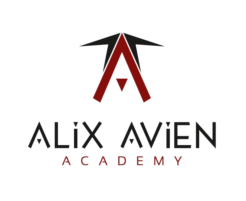
In 2023, I had the opportunity to design a distinctive icon for Alix Avien Academy, a brand dedicated to education, creativity, and professional development in the beauty industry. The brief called for a visual identity that could complement the existing logo while conveying the academy’s core values at a glance.
Concept Rooted in Purpose
The concept behind the icon is both simple and symbolic: three ‘A’ letters coming together in a unified form. A single large ‘A’ provides the structural foundation, while two smaller ‘A’s are positioned above it — evoking the shape of a graduation cap. This subtle visual metaphor reinforces the brand’s education-focused nature, while maintaining a modern and elegant aesthetic in line with Alix Avien’s style.
Seamless Logo Integration
Designed to be used alongside the main logo, the icon functions as a flexible visual element across both digital and print platforms. Whether applied to certificates, packaging, or digital content, it strengthens the overall branding and adds a recognisable mark that embodies both learning and aspiration.
Design with Meaning
This project demonstrates how thoughtful icon design can communicate a brand’s message with clarity and depth. By drawing on familiar symbols and integrating them with subtlety, the icon supports the academy’s identity without the need for words — a mark of strong, strategic visual storytelling.
If your brand needs a bespoke icon that aligns with your values and enhances your visual identity, let’s bring your ideas to life through meaningful design.